Top Cyber Security Threats for FinTech in 2024
In this article we will be exploring some of the top emerging or returning cyber security threats for the FinTech field, as well as best practice suggestions against them.
In this article we will be exploring some of the top emerging or returning cyber security threats for the FinTech field, as well as best practice suggestions against them.

The EMEA wealth management outlook for 2024 is a dynamic response to the convergence of technology, client expectations, and economic shifts.
The US market has a strong foundation in big data technology, with a projected growth rate of a remarkable 12% CAGR until 2030.

We are proud to announce that Quantifeed has been awarded the prestigious 2023 Deloitte Technology Rising Star Award.
As we step into 2024, several investment trends are shaping the market, offering both challenges and opportunities for investors.
As the year draws to a close, we reflect on a period filled with gratitude, innovation, and substantial growth. Read on to explore some of our notable highlights from this year.
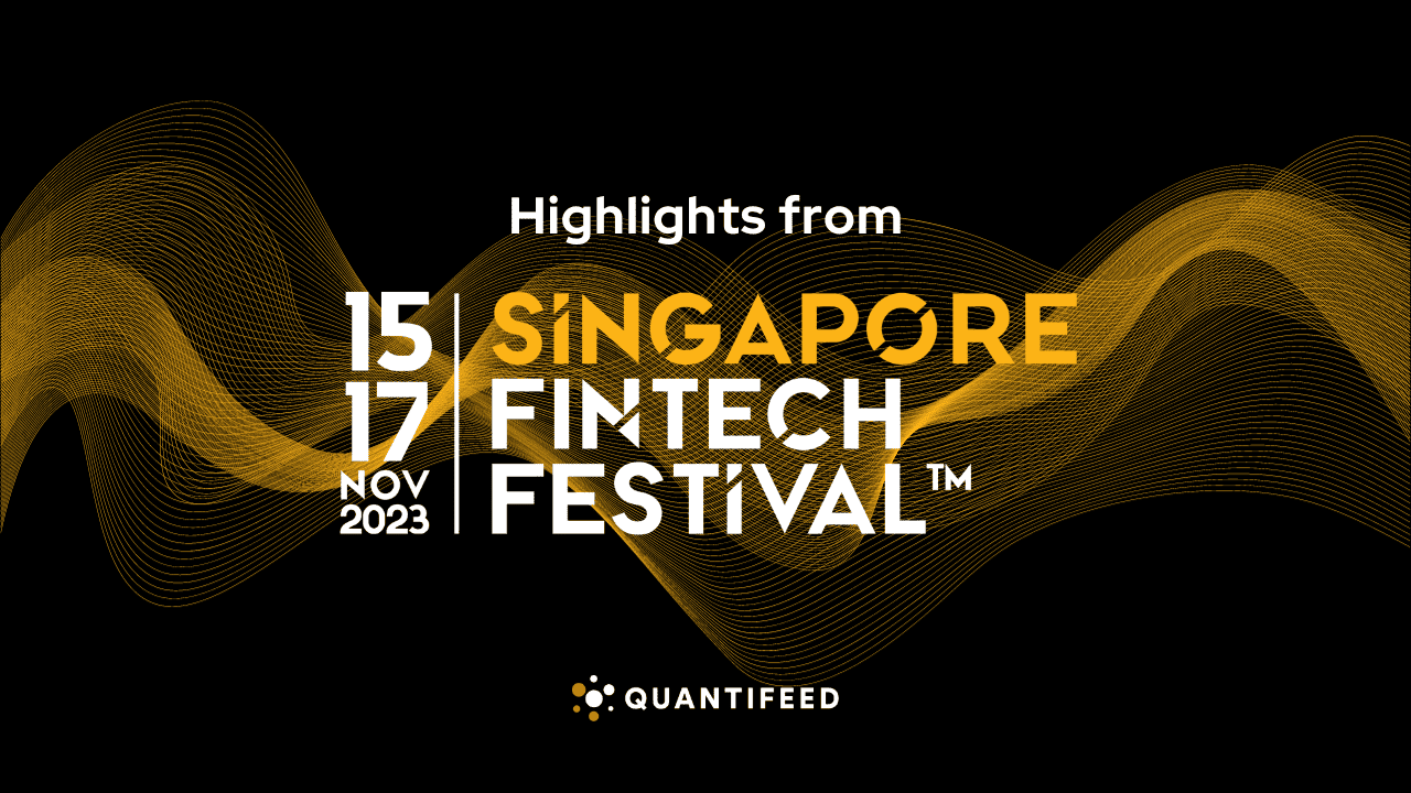
The Quantifeed team participated in Singapore FinTech Week 2023 from November 15th to 17th. With over 62,000 attendees from 100+ countries, the event showcased major trends and announcements in FinTech. Read on for our summary
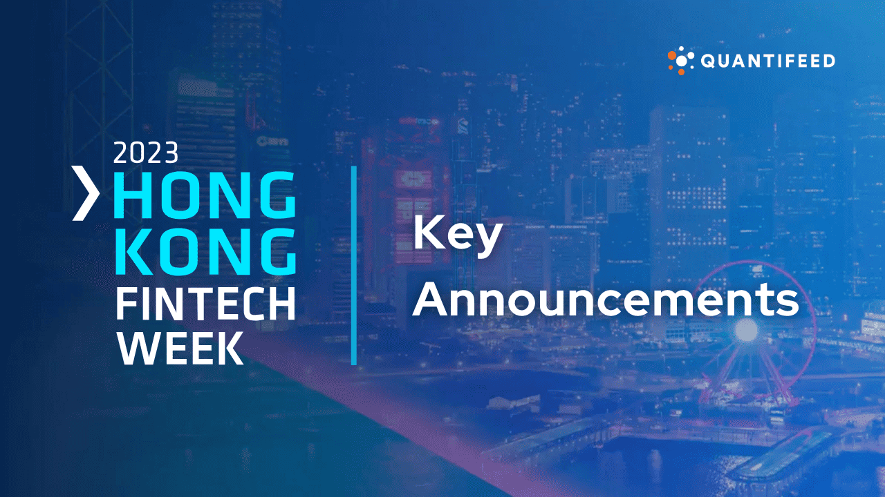
From sustainable finance to digital transformation, cross-border opportunities, and talent development, Hong Kong is cementing its status as a global FinTech hub.

We are pleased to introduce this month’s portfolio in Robotics US. Created in late 2016, this strategy focuses on US robotics opportunities, spanning industries like healthcare, consumer products, home applications, agriculture, logistics, and entertainment.
When you visit any web site, it may store or retrieve information on your browser, mostly in the form of cookies. Control your personal Cookie Services here.